Howdo: End-to-end B2B2C platform design for enhanced user and provider experiences.
Role: Project lead, working on Research, UX & UI Design supported by one other designer.
(Worked on at Narrate)
Context
Howdo is where learning and fun collide. A marketplace for everyday education, offering in-person classes, courses, and workshops
Problem statement
Howdo had two main challenges:
Meeting the needs of learners desiring interactive and social learning experiences, clearly distinguishing itself from other course providers.
And addressing the frustrations of providers who struggle to showcase their offerings effectively.
Goals
Develop a user-friendly platform that make its easy for users to find, compare and book courses & workshops.
Develop a robust backend interface that allows providers to easily upload, edit, and showcase their offerings.
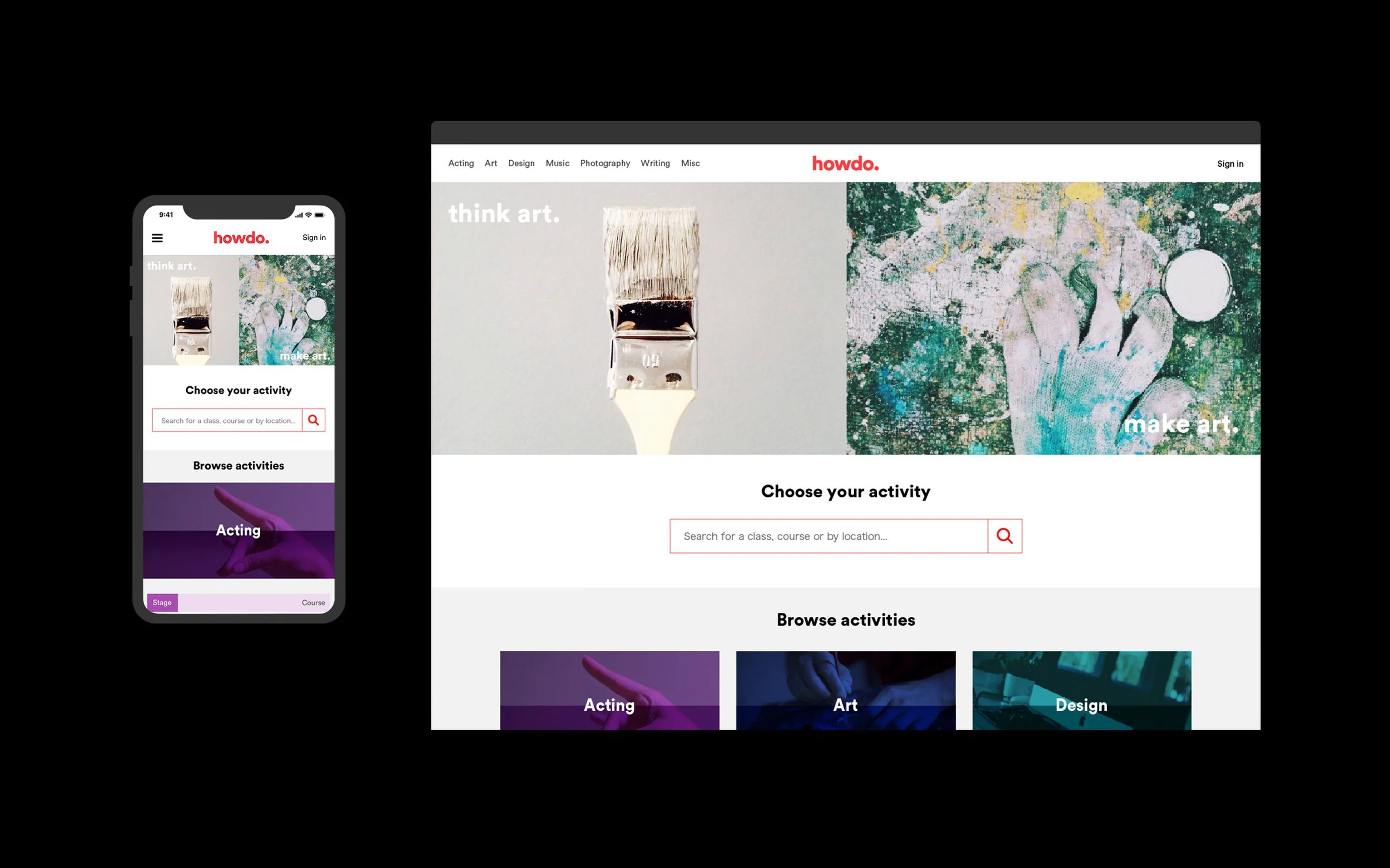
Create a strong identity & UI to communicate Howdo's unique value proposition as a platform that bridges the gap between entertainment and learning.
Business Goals
User base growth: Accelerate user acquisition and retention to establish a strong market presence.
Provider network expansion: Cultivate a diverse and high-quality provider network to enhance course offerings.
User experience excellence: Prioritise a seamless interface and superior service to ensure user satisfaction and loyalty.
Research
I conducted extensive research, including competitor analysis, user surveys and interviews to understand the problem deeply. This guided my work, enabling user-centric solutions that effectively addressed the challenges.
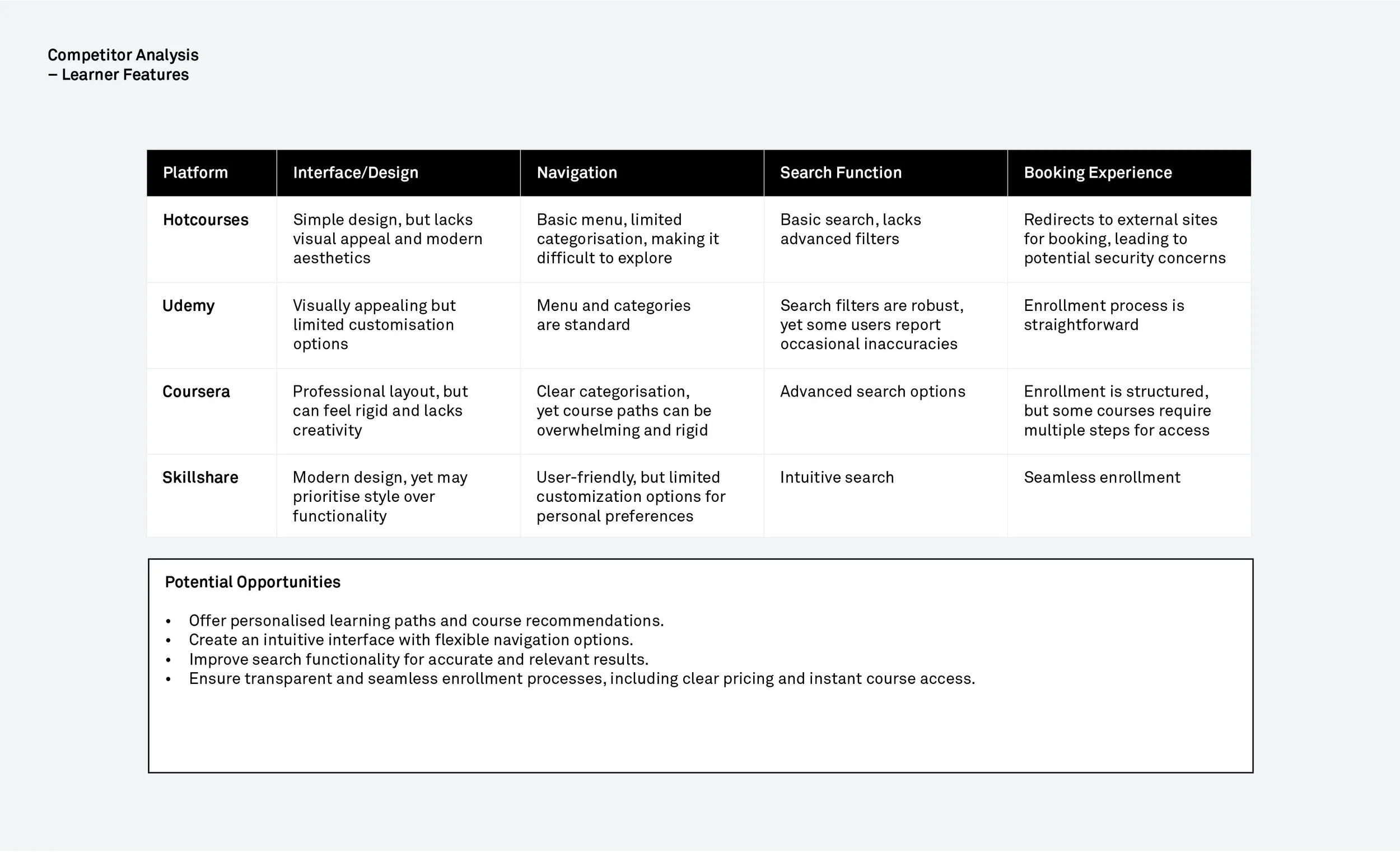
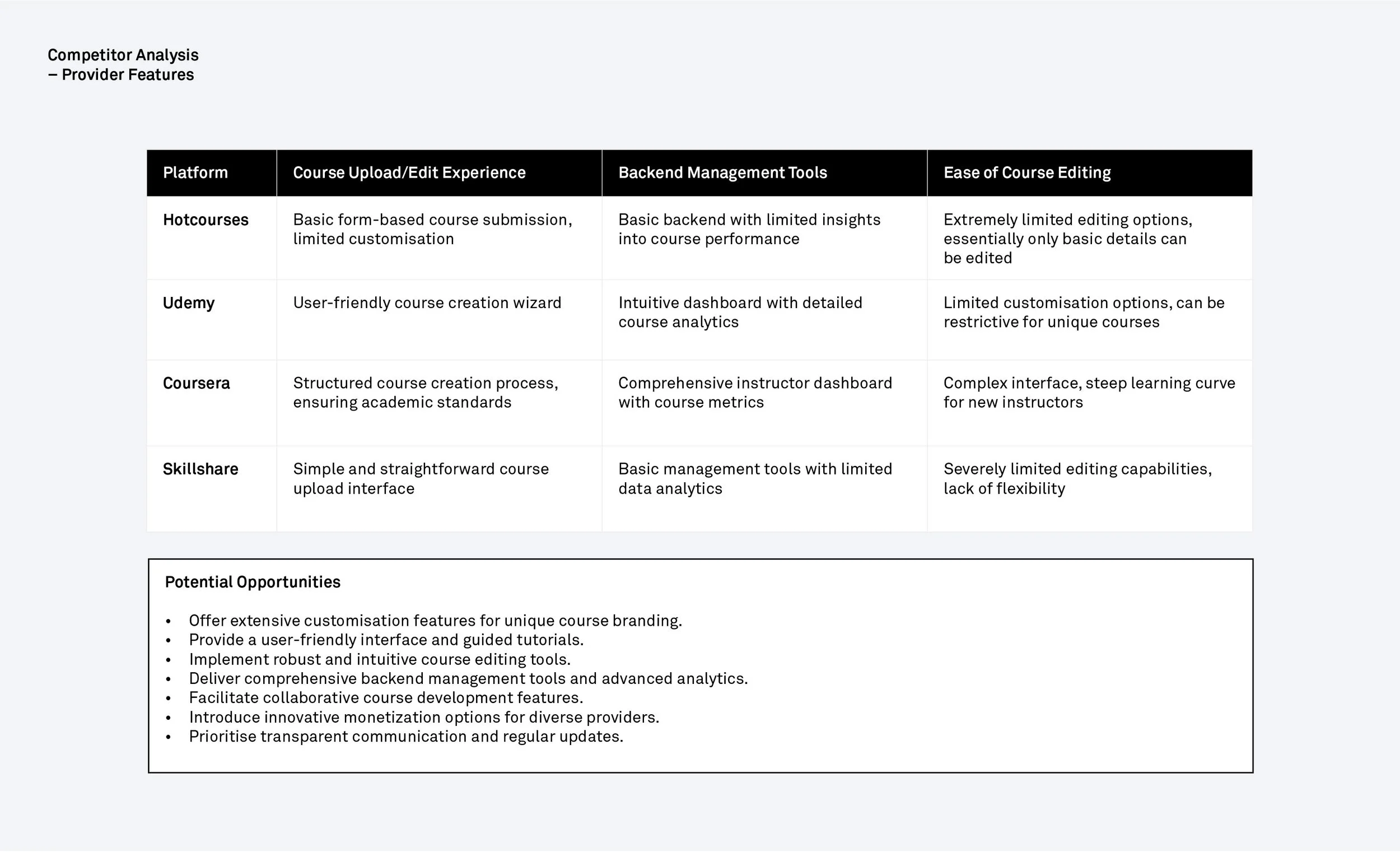
Competitor Analysis
Studying existing course provider platforms, I examined their features and user experiences for both learners and providers. This helped me identify potential opportunities for Howdo.
User Interviews
I surveyed 56 participants to understand user behaviour and select interview candidates. I collected qualitative and quantitive data on their habits, interests, and readiness to engage with a platform like Howdo.
Following this, I conducted 6 detailed interviews with potential users, both learners and providers, to learn about their experiences with competing online learning platforms. This helped me gain insight into their preferences, pain points, and expectations regarding online learning platforms.
“Often, I come across courses that I’m not ready to sign up for immediately, and I end up forgetting about them. It would be great to have a way to bookmark these for later when I’m ready to enroll.”
“I’m responsible for managing our courses and uploading them one by one is a real time drain. I need to be able to bulk upload them and post our classes quickly and efficiently.”
Analysis and Synthesis
From my research, several key user needs and innovation opportunities were identified.
Prioritising Features
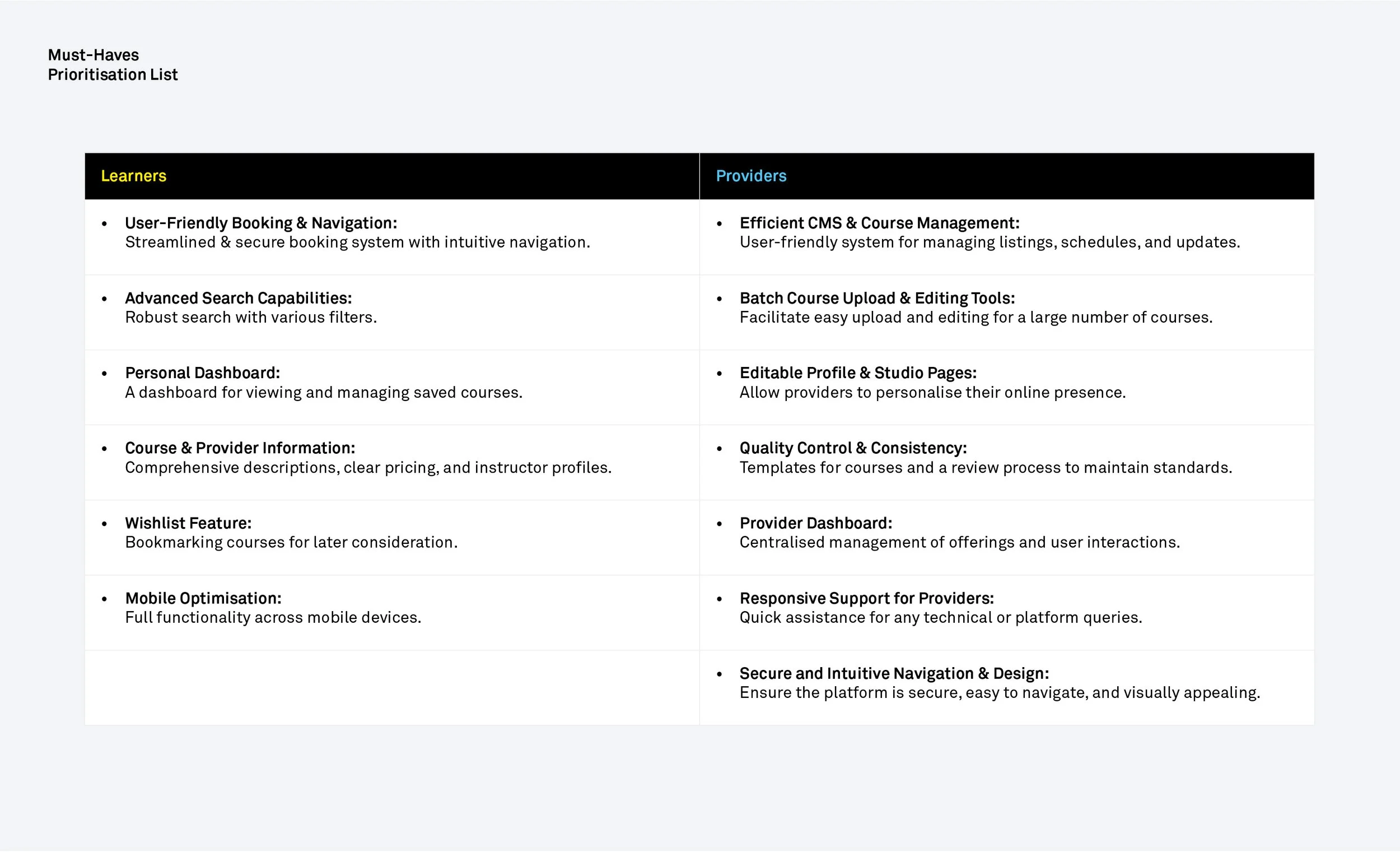
Along with the CEO & CTO we prioritised product features for launch using the MoSCoW framework. We ensured they aligned with Howdo’s business goals and user benefits, whilst also considering our resources and timeline.
As we were developing a Minimum Viable Product (MVP), the primary focus was on building just the ‘Must-Haves’ enabling Howdo to launch a product with enough features to satisfy early adopters and fulfil the core purpose.
Personas
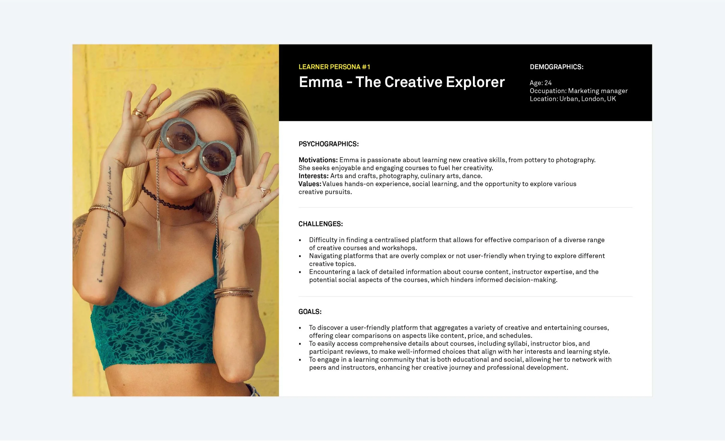
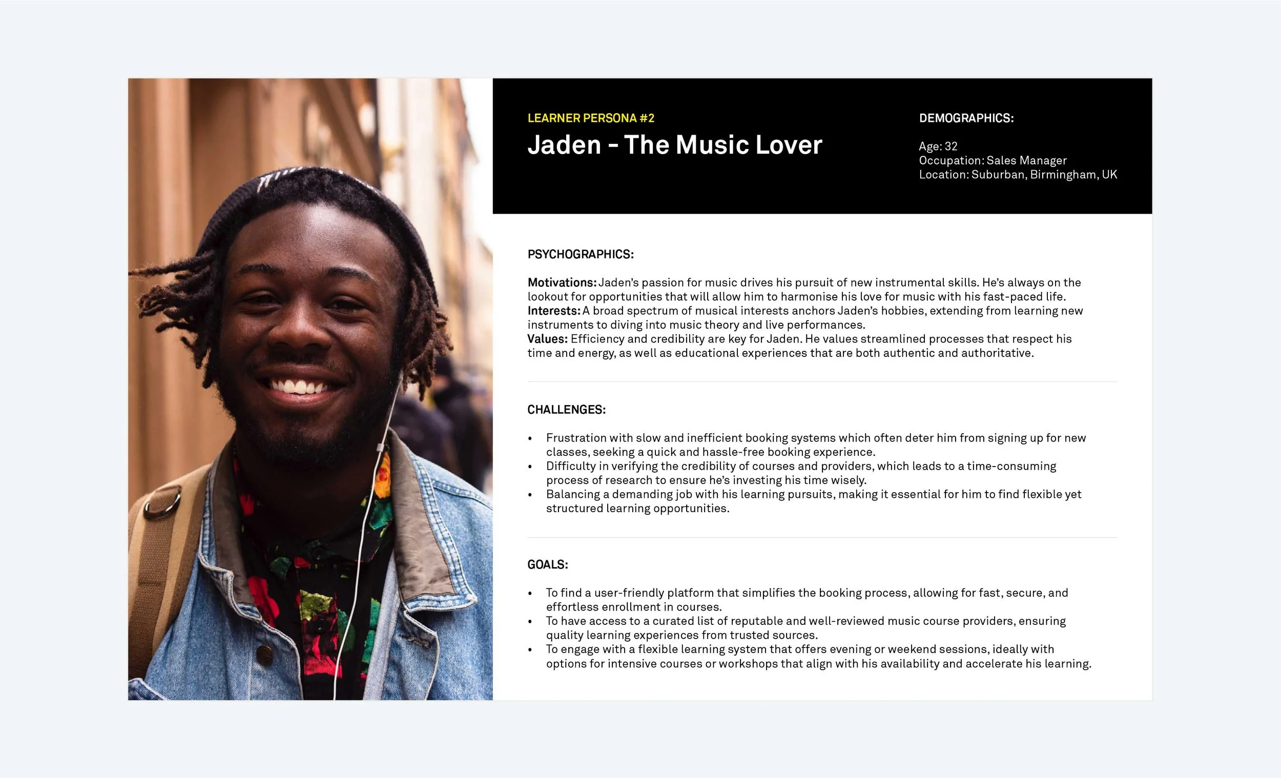
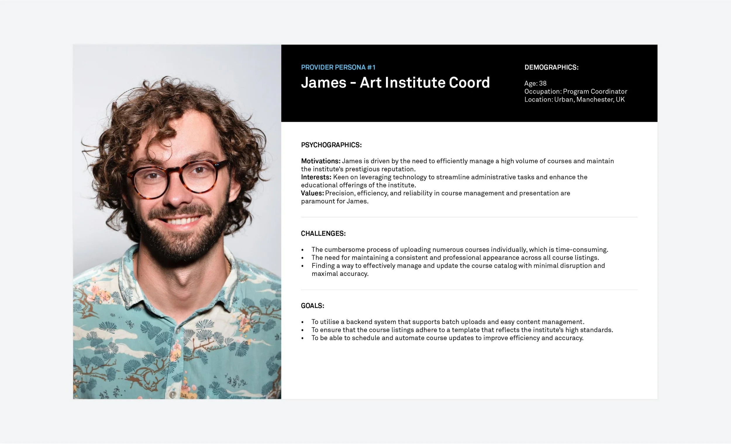
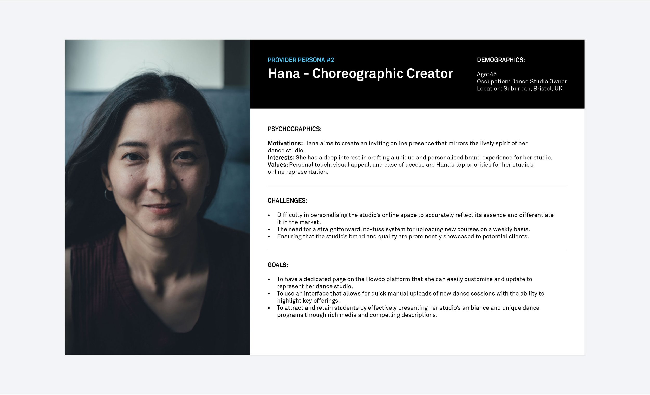
I then developed personas to define my ideal learners (x2) and providers (x2) which helped me understand user behaviours, goals, and motivations, and to guide the design process.
User Flows
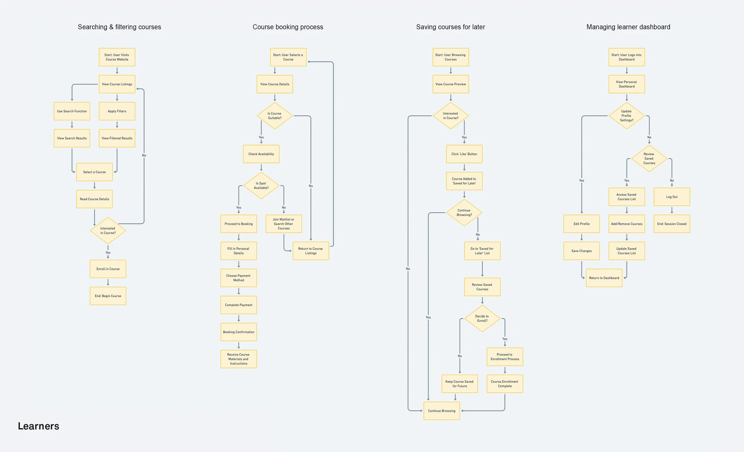
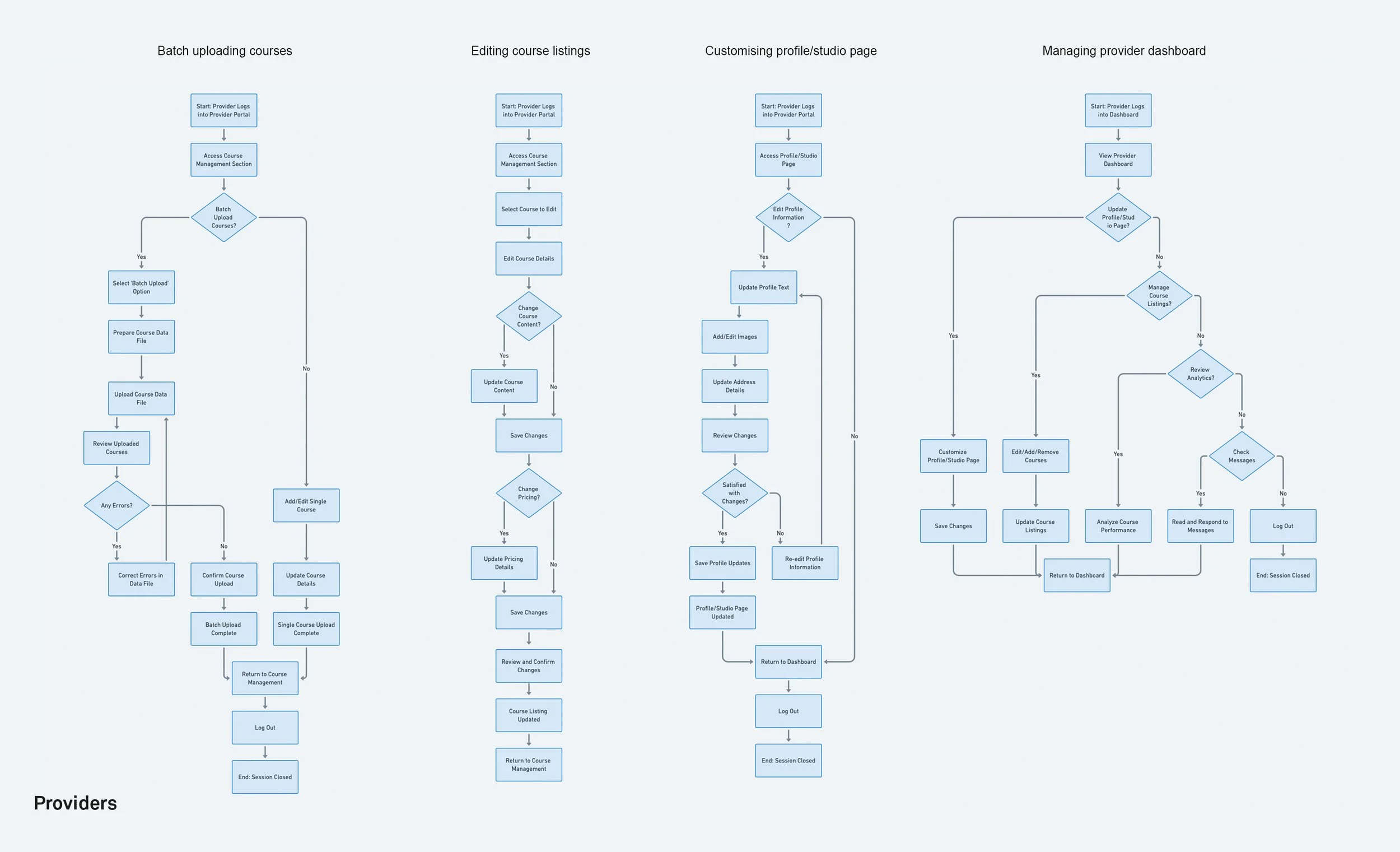
Due to time constraints I decided to focus on mapping out user flows because of the immediate, actionable insights they offer that can be directly applied to the design process.
I focused on crucial user flows, targeting key user interactions, to enhance the user experience. These included:
Learners' Booking Process: Course search to booking completion.
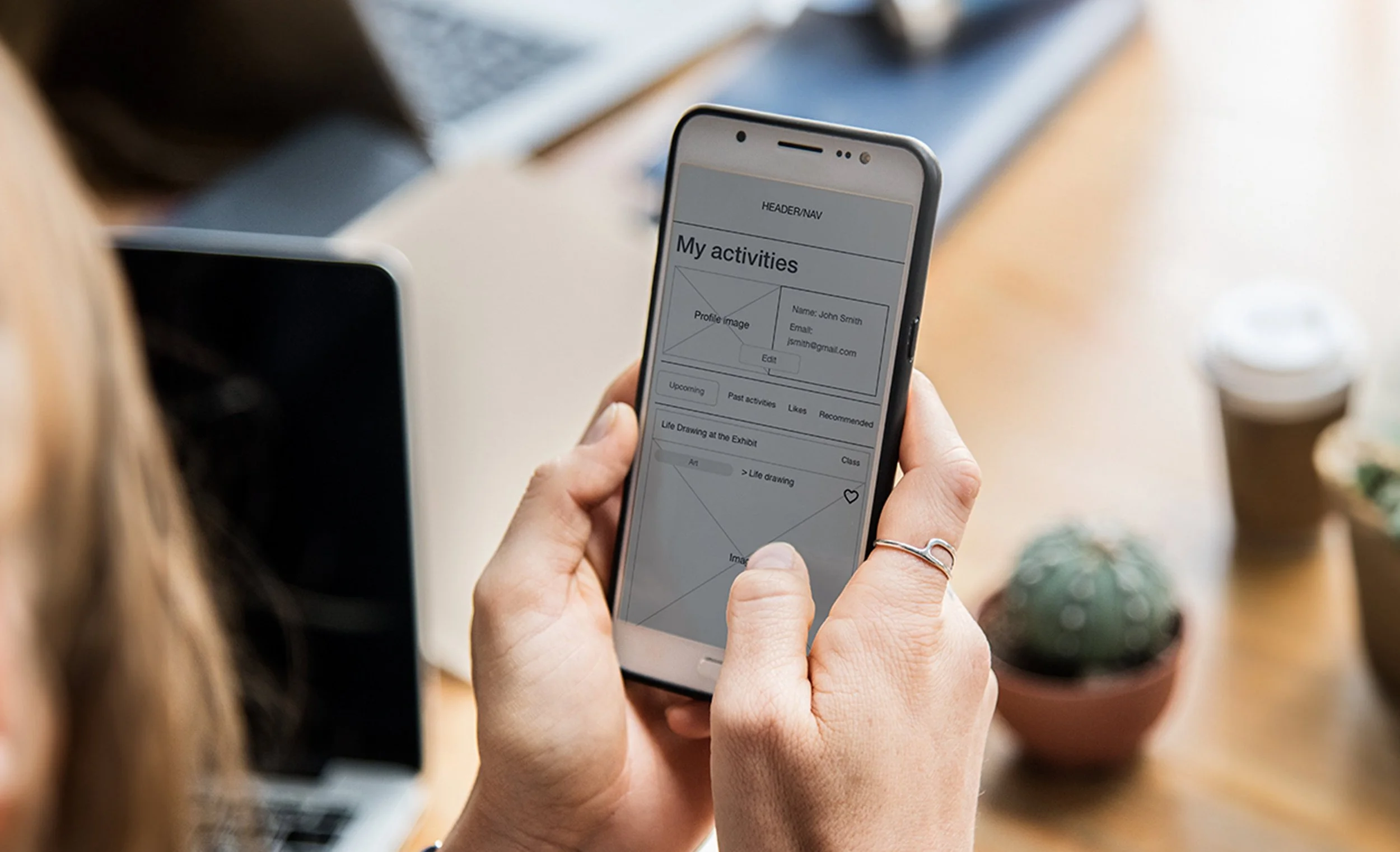
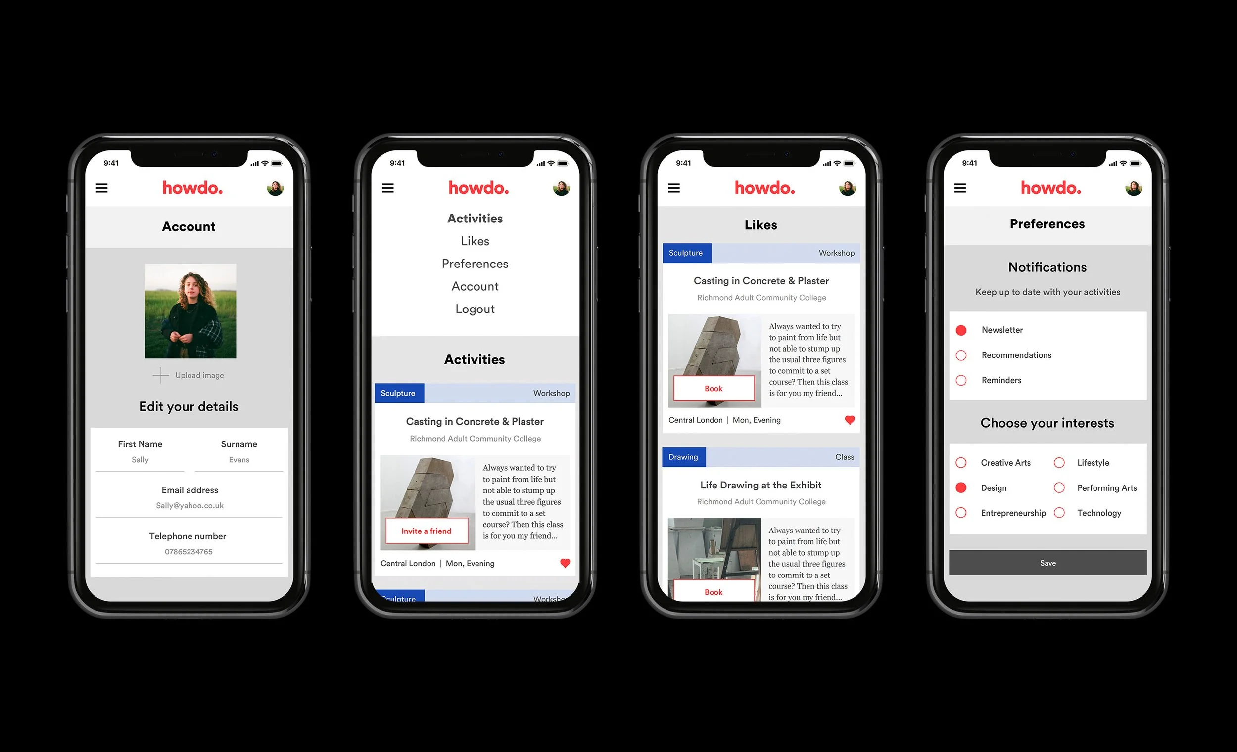
Learners' Personal Dashboard: Managing profile info and handling saved and wishlisted courses.
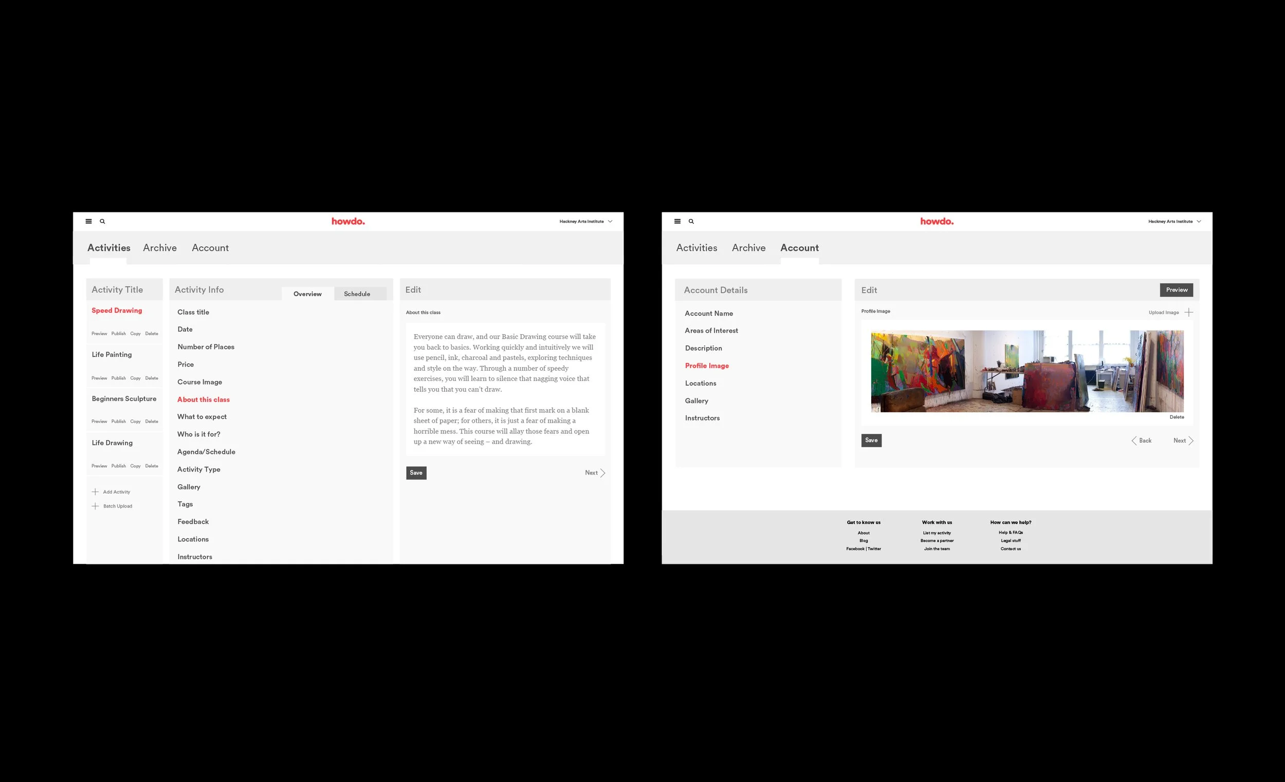
Providers' Course Management: Uploading and editing courses.
Providers' CMS Navigation: Managing dashboard and profile editing.
Ideation and Prototyping
Information Architecture and Sitemap
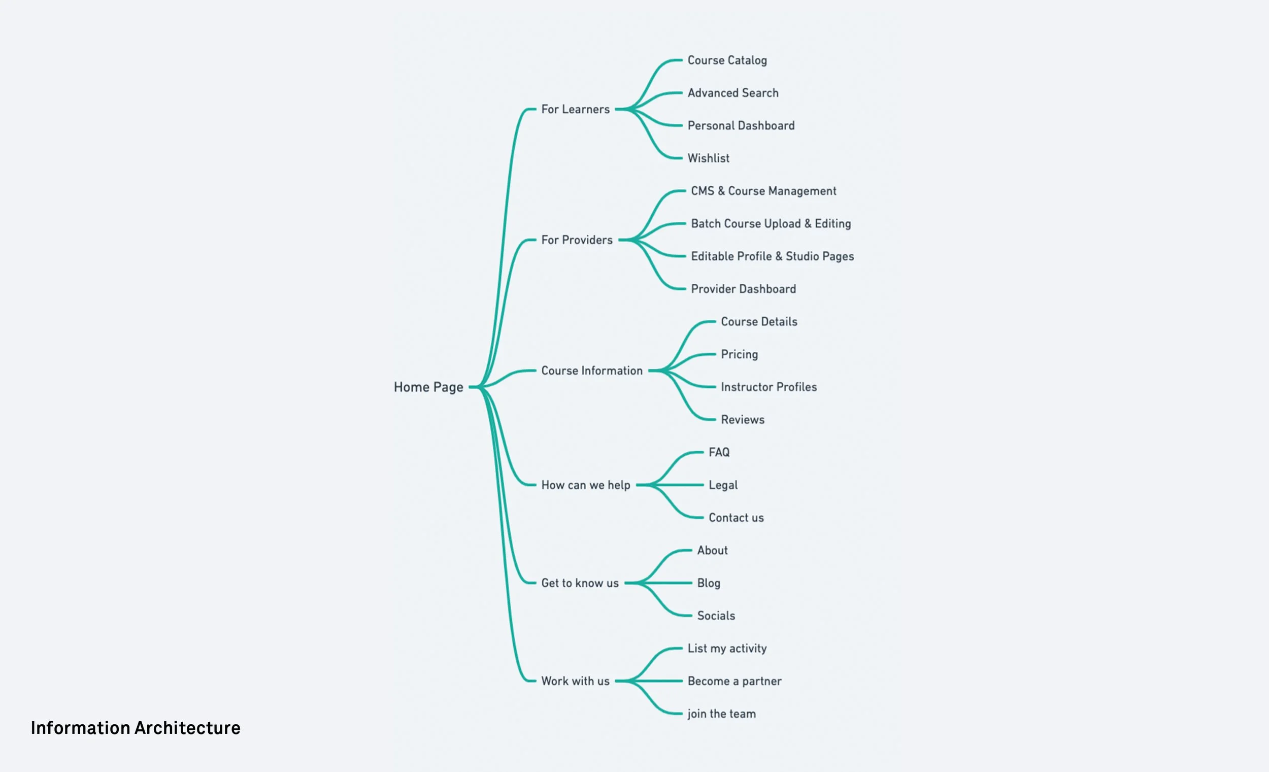
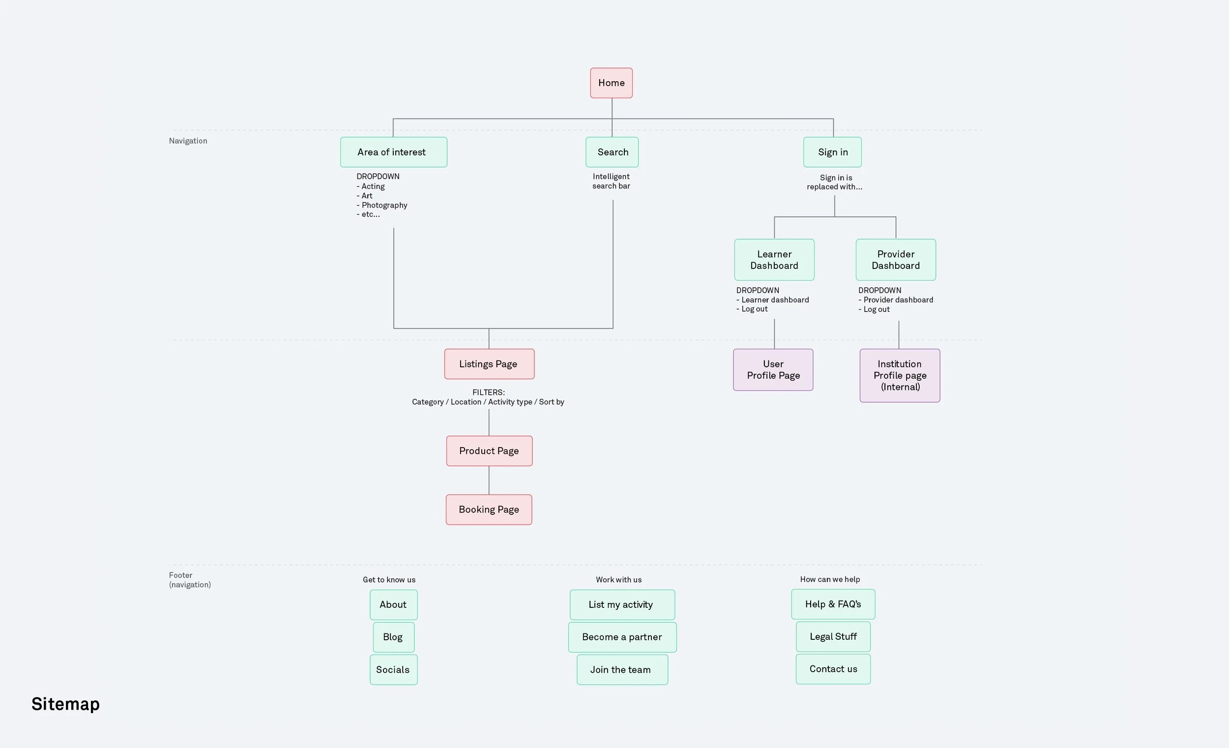
I developed the IA to provide a clear, intuitive structure, in order to make navigation effortless for both learners and providers. I then created a sitemap detailing the site's layout, ensuring coherent flow and effective linkage between pages.
Wireframes
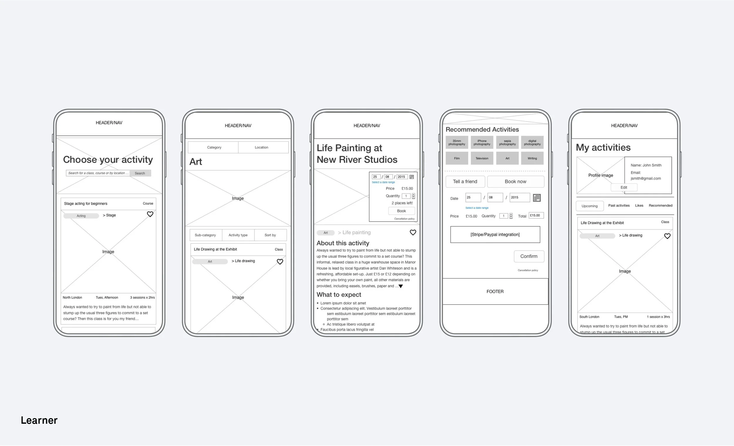
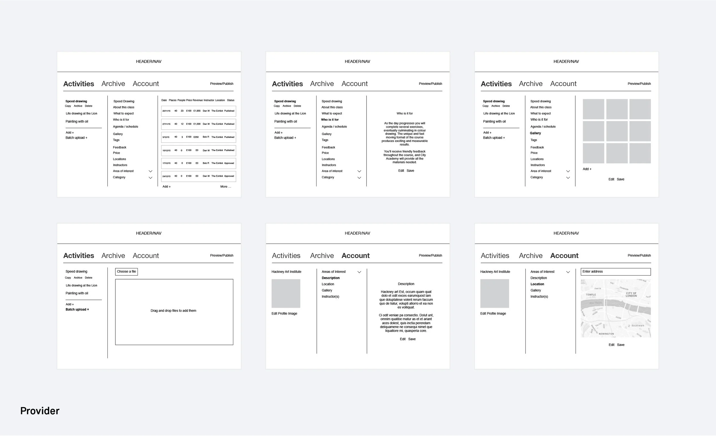
I prioritised wireframing the essential pages and components from the user flows I had worked on earlier. This included:
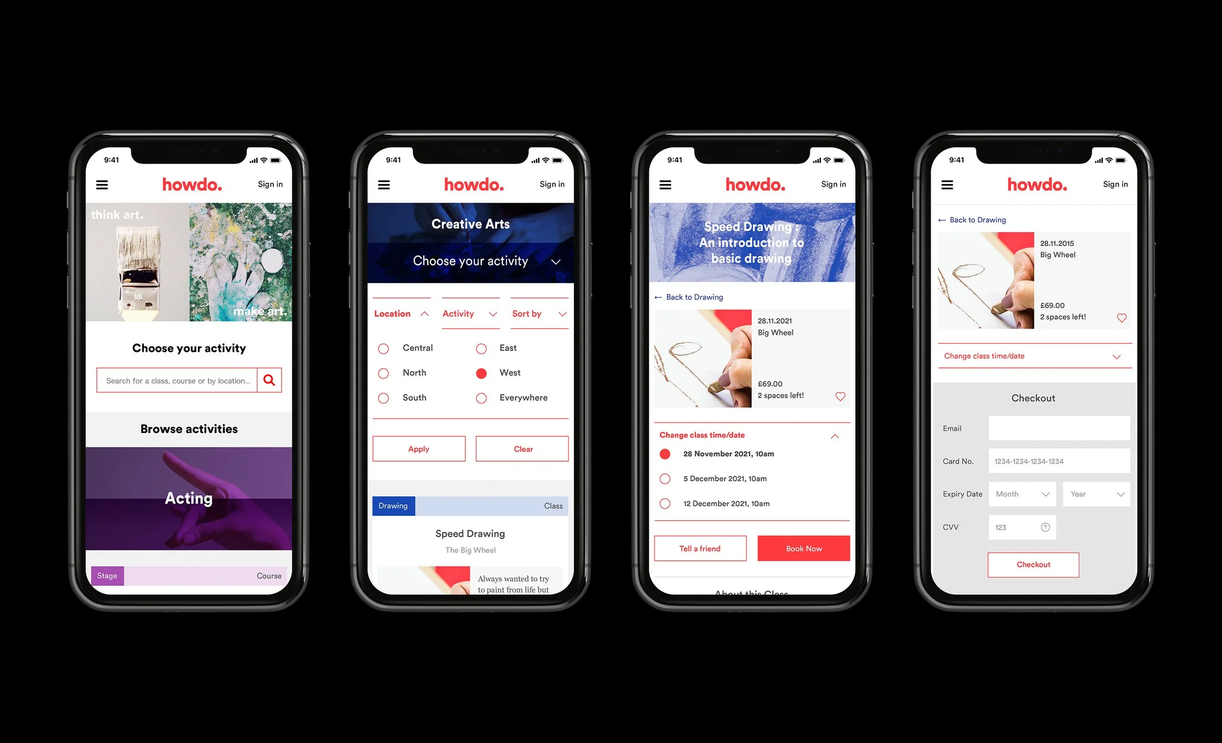
Homepage: The initial user contact point.
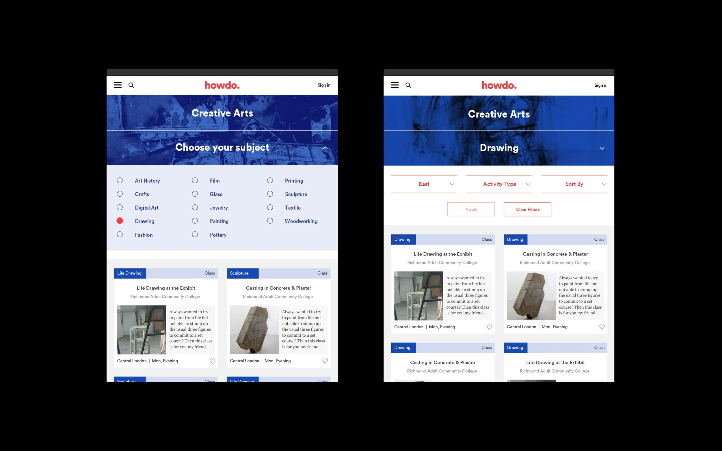
Search results page: Displays course listings, filters, comparisons.
Course detail page: Offers detailed course information for learners.
Booking interface: Enables learners to book courses.
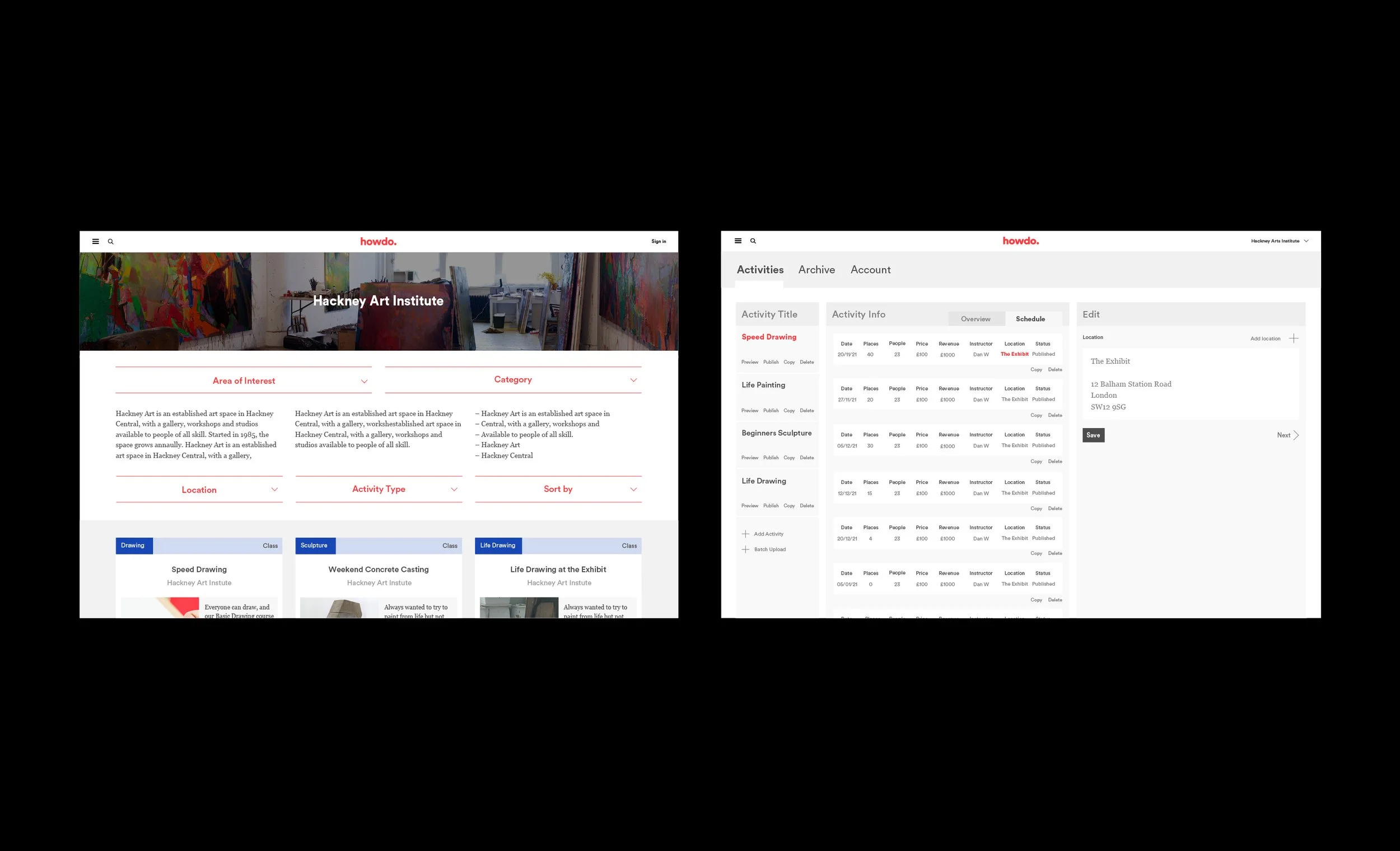
Provider profile/studio page: Providers showcase their services.
CMS interface: Providers manage courses and profiles.
My research also indicated that learners primarily utilise their mobile phones for searching and enrolling in courses, leading us to adopt a mobile-first strategy for them. Conversely, the findings revealed that course providers predominantly use laptops or desktops for managing their courses, prompting us to implement a desktop-first approach to cater to their requirements. But both were still fully responsive.
Low Fidelity Prototypes
I created low fidelity mockups to assess user interactions with 6 users (3 learners and 3 providers). I worked with the users in person and set tasks for them to complete. Through this user testing, I garnered many invaluable insights that influenced my design decisions.
One important realisation emerged from the process for learners: my initial assumption was that situating the 'Location' selection in the top tier navigation would be the best approach. However, user testing revealed that it was actually more effective to include it as a filter in the secondary menu.
One key insights discovered for providers: introducing a sub-navigation in the Activities section to easily toggle between 'Overview' and 'Schedule' was essential. Previously, the schedule was within the overview, but the users wanted it to be be immediately accessible.
High fidelity prototypes
I created high-fidelity prototypes and conducted testing with 6 users. Now that the designs were rolled out I wanted to check for any final usability issues.
One issue flagged by the provider was that there was no progress indicator during the upload process so I amended the designs to include this and added an error message.
User feedback led to improvements with wording and textual content. One example was the modification of the CTA, where 'Recommend' was replaced with a friendlier 'Tell a friend' option for sharing courses, a change inspired by user suggestions.
This phase also looked at visual design enhancement, cross-platform compatibility and stakeholder feedback integration.
Final designs
Results
Achieved a strong 35% conversion rate, reflecting the effectiveness of the user-friendly interface and intuitive booking system.
90% of providers found it easy to upload and manage course content, indicating a seamless experience for providers.
Howdo earned an impressive average user rating of 4.8 out of 5, with 85% of users willing to recommend Howdo, showcasing high customer satisfaction.
Experienced a notable 30% increase in user revisits within the first month, indicating early signs of user loyalty and platform retention.
