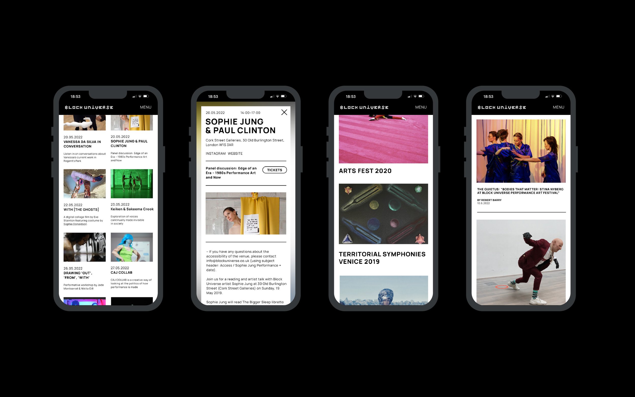
Block Universe: Fusing artistry and functionality in a complete platform redesign.
Role: Research, UX & UI Design.
(Worked on at Narrate)
Context
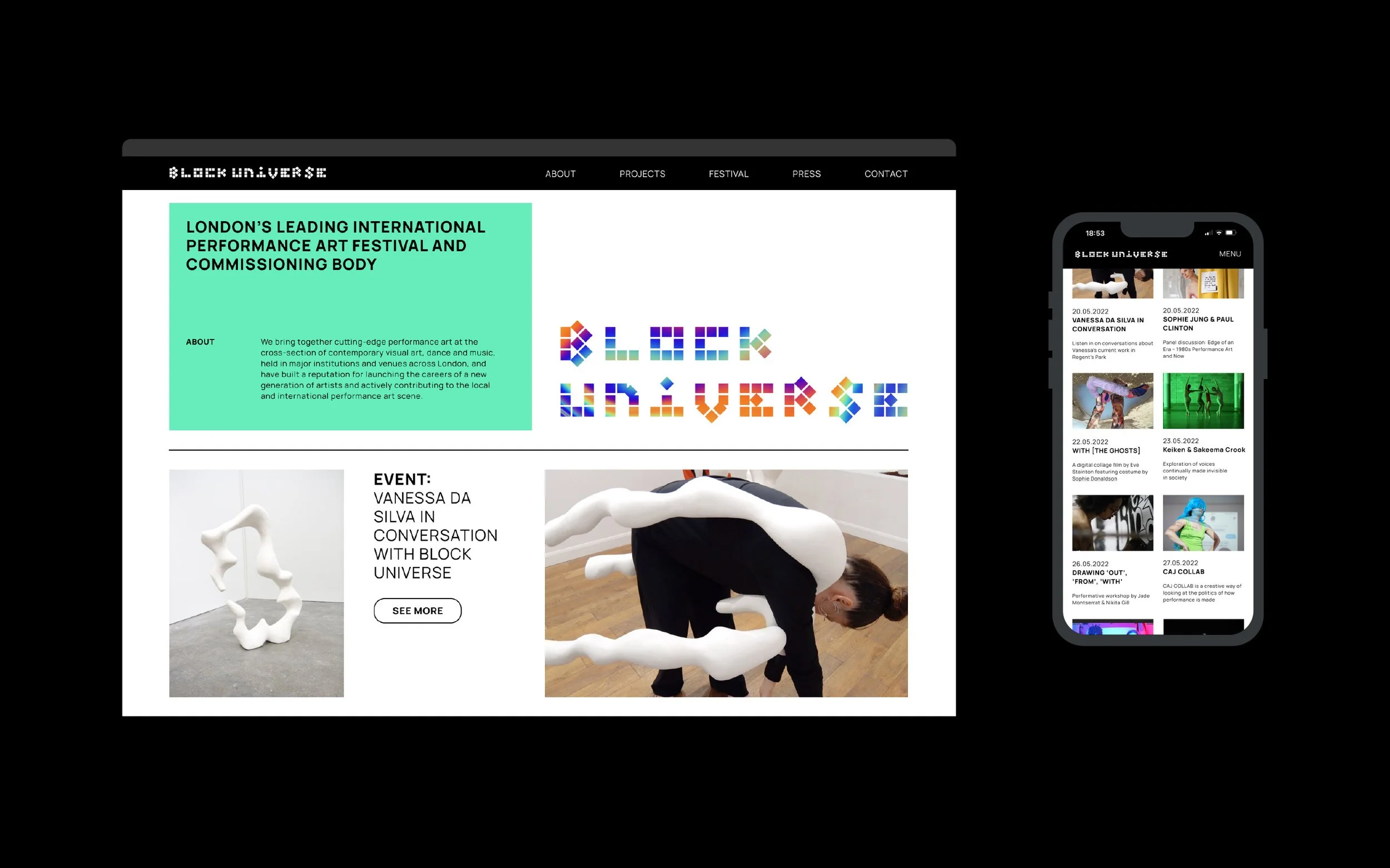
Block Universe is London’s leading international performance art festival and commissioning body.
Problem statement
Block Universe needed to improve its online presence to effectively communicate their innovative and diverse nature. Additionally, the site's lack of intuitive navigation and accessibility was limiting broader audience engagement.
Goals
Develop a user-friendly interface with streamlined navigation making it easy to access information.
Design a UI to reflect a modern, cool aesthetic; showcasing artist quality and diversity.
Encourage engagement through user interaction and participation through compelling content.
Business Goals
Audience Expansion: Attract a younger, diverse audience, extending reach within the art community.
Increase Engagement and Revenue: Boost ticket sales, event participation, and funding opportunities.
Research
Competitor Analysis
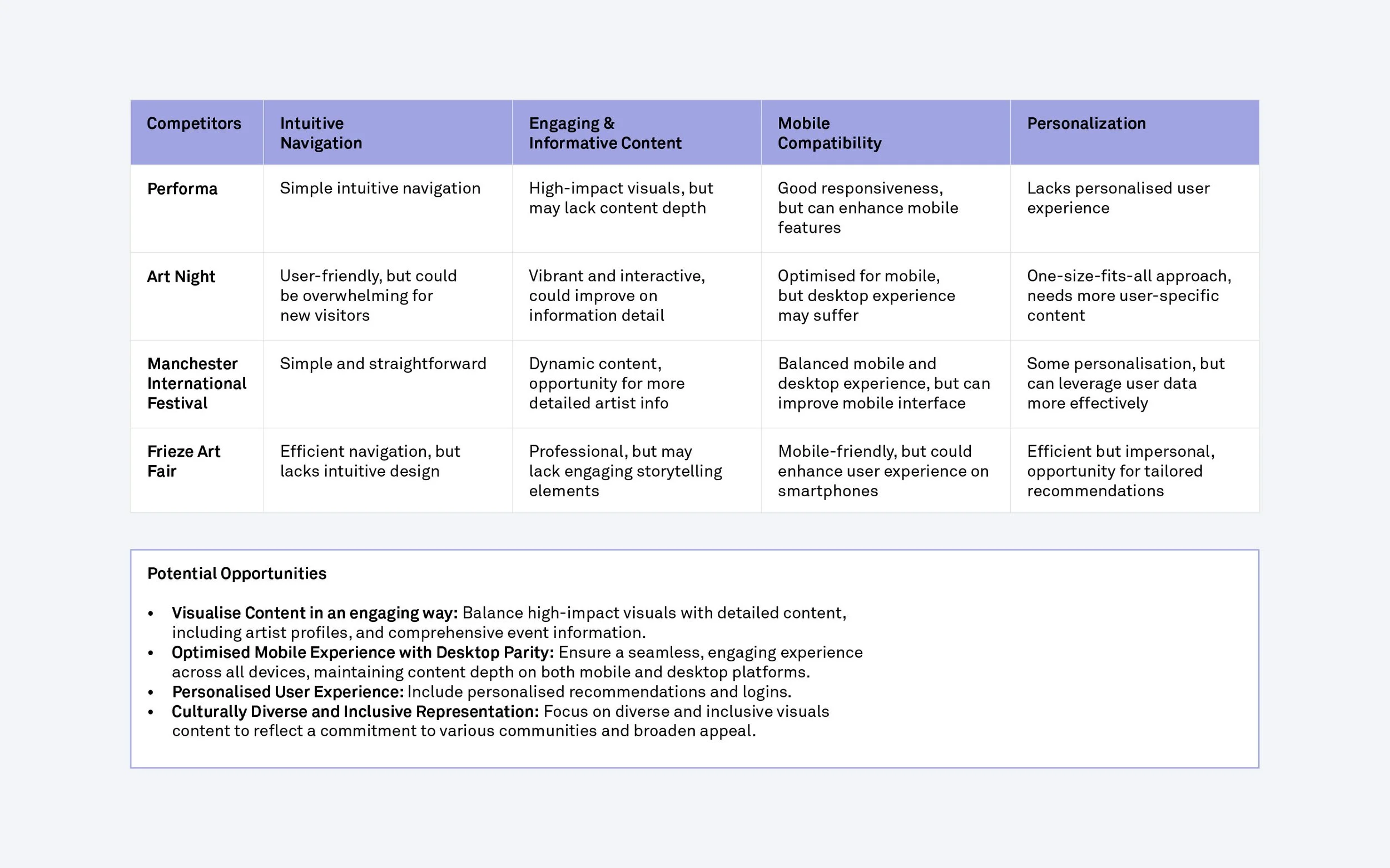
While Block Universe didn't have direct competitors, the companies I examined had some similarities, such as; their emphasis on contemporary and performance art. However, they varied significantly in scale, geographic reach, and business models.
Instead of focusing on the specific features of their platforms, I chose to analyse my perceived key customer needs and pain points for a Block Universe user. I examined how these 'competitors' met these needs and identified their strengths and areas for improvement. This approach helped me use these insights as a strategic tool to address these aspects for Block Universe.
Target Audience
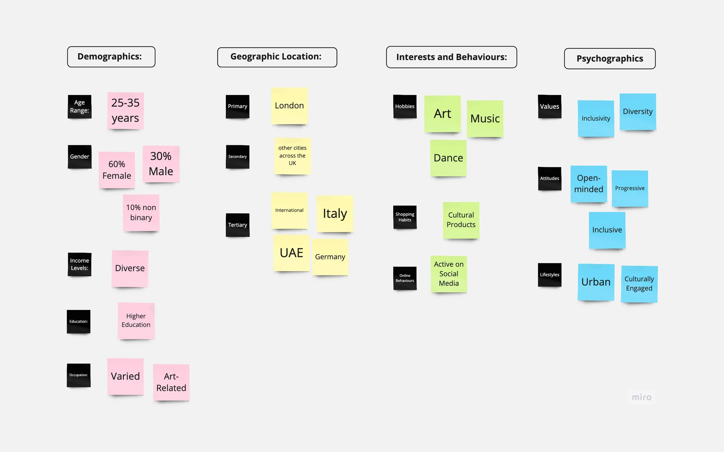
Block Universe had a clear understanding of their target audience. However, I conducted a brief brainstorming workshop with them to further refine and define the customer segment they aimed to reach. I knew this would help when selecting users for interviews.
User Interviews
Having completed the customer segmentation, I was clear about the types of individuals to engage with. Fortunately, Block Universe provided a database of potential contacts. I chose to filter these contacts solely by age and location and settled on conducting user interviews with three individuals. Due to time and financial constraints I also worked with these three individuals for all stages of testing.
My questions focused on their interactions with performance art, digital platforms, and their specific needs and preferences related to these areas.
“As a newcomer to performance art, I’d like a section dedicated to the artists so I could find out more about them.”
“I sometimes find myself lost in the amount of information on art event platforms and can’t find what’s relevant to me.”
“It would be good to be able to look back at previous festivals to see what to expect”
Analysis and Synthesis
Prioritising Features
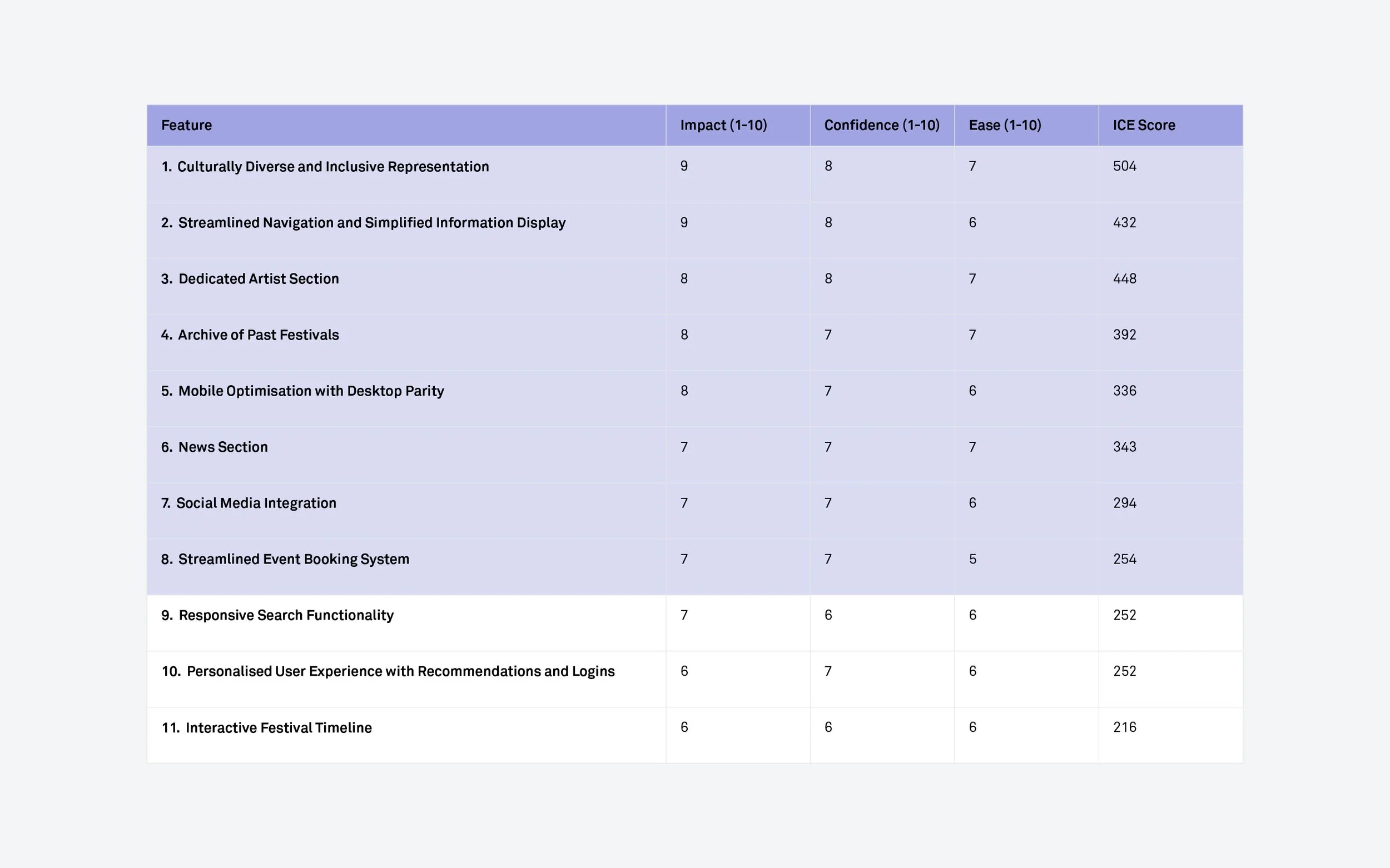
I decided to use the ICE (Impact, Confidence, Ease) method for prioritising features because of the emphasis on ease of implementation as we had a limited timeframe.
Together with Block Universe and the developer, we evaluated all the features to identify the most critical ones to develop. For the launch, we planned to concentrate on the top 8 features.
Personas
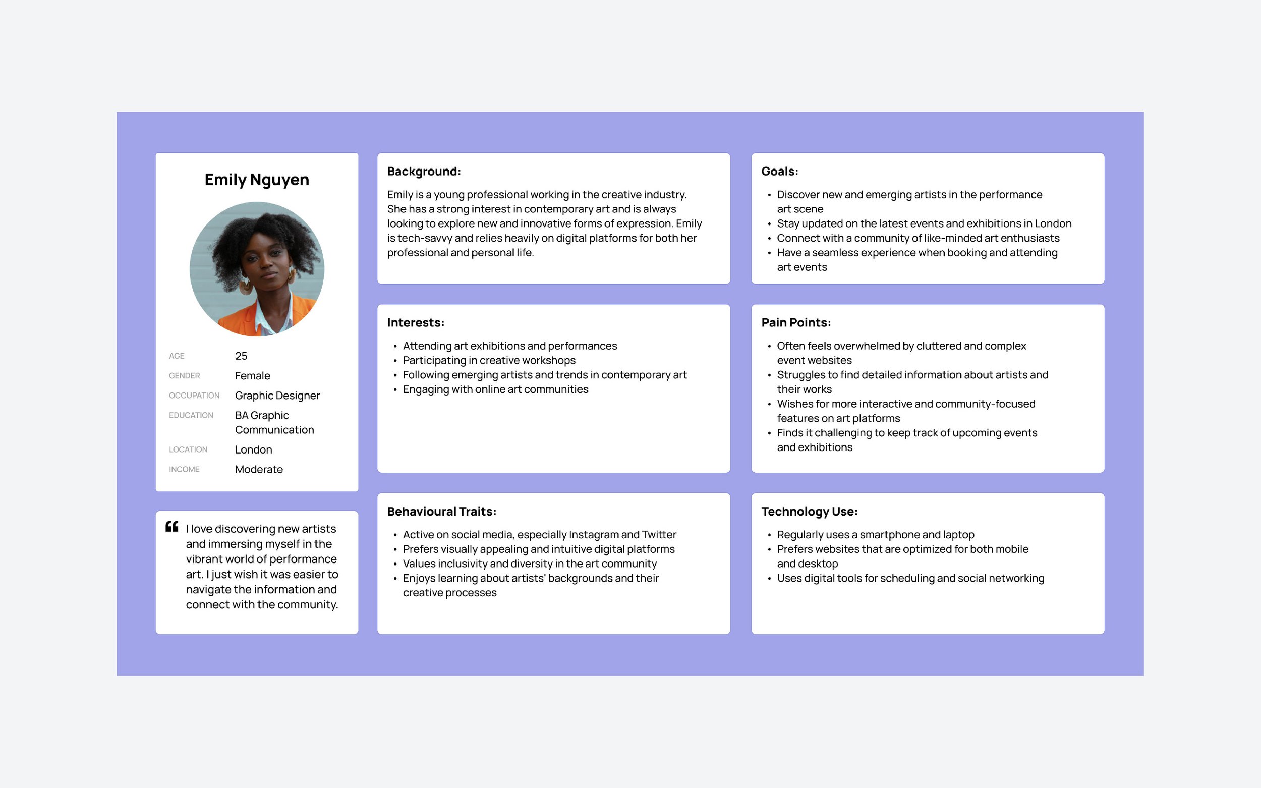
From my research, I developed one user persona, Emily Nguyen, a 25 year old graphic designer from London. She embodies the characteristics and needs of the target audience. This provided valuable insights for tailoring the platform design to enhance user engagement and satisfaction.
User Journey Mapping
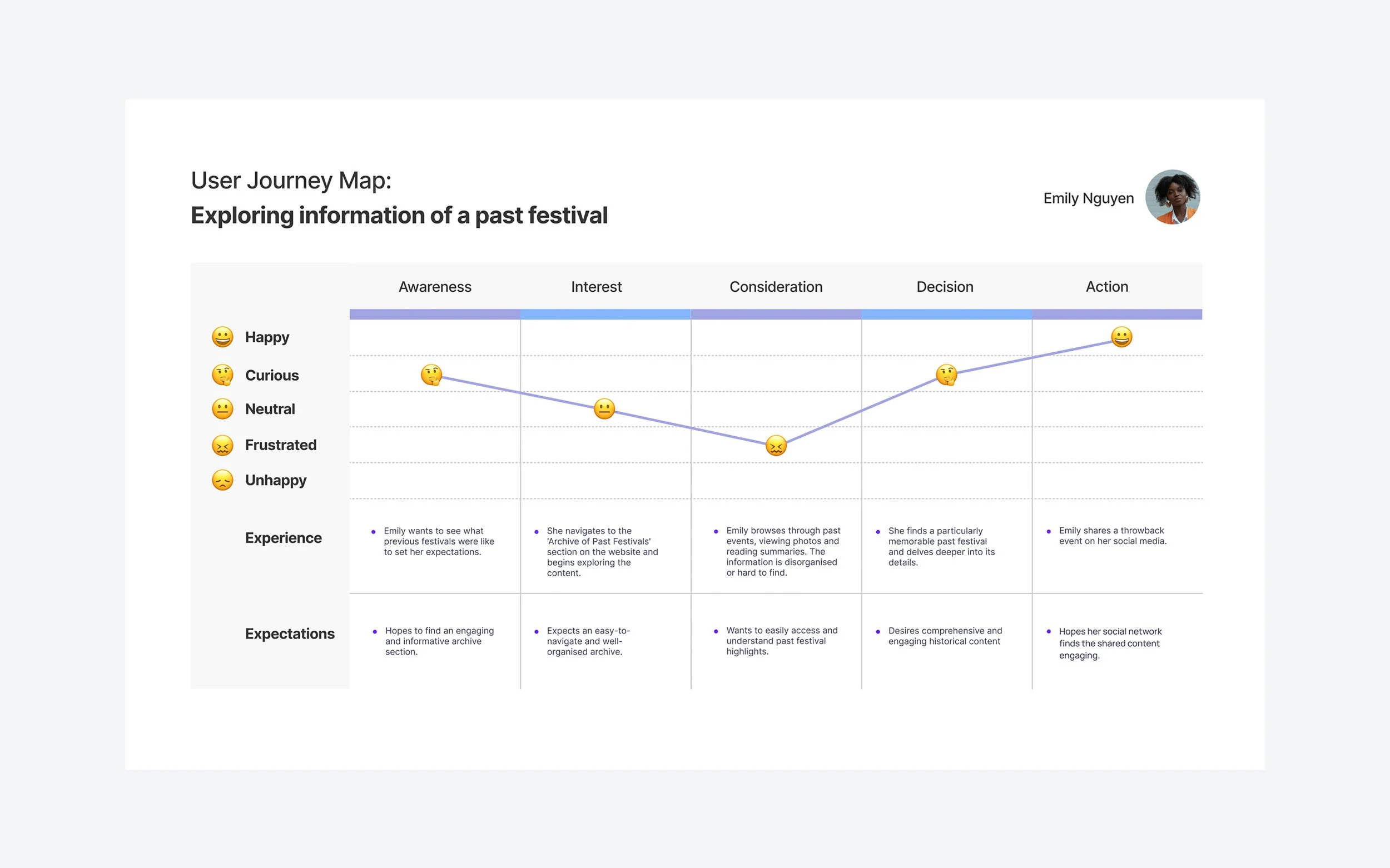
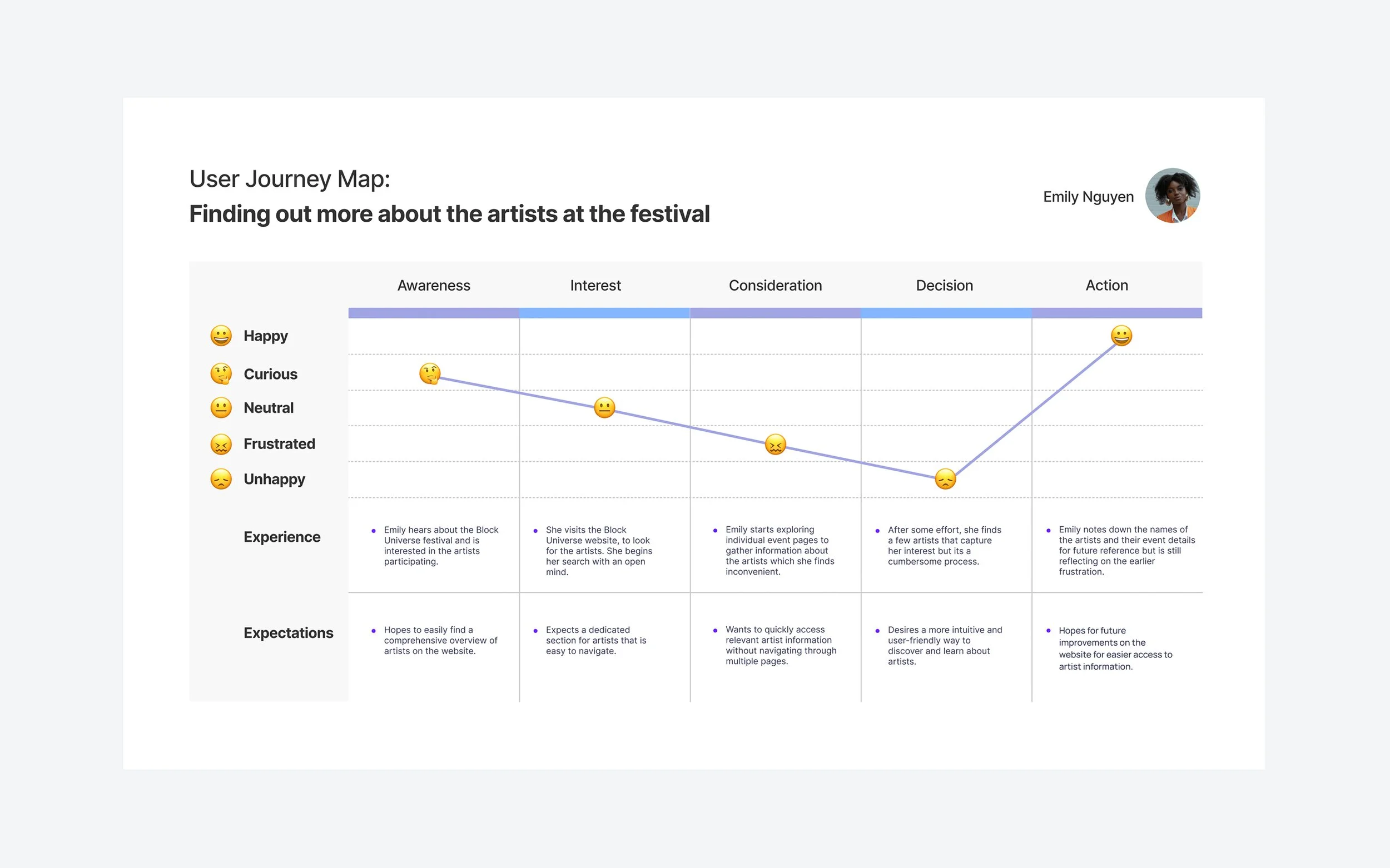
In creating user journey maps for a selection of the features, I aimed to empathise with our users' experiences, particularly focusing on their emotional journey and expectations. This helped me visualise and plan the user experience from the very beginning.
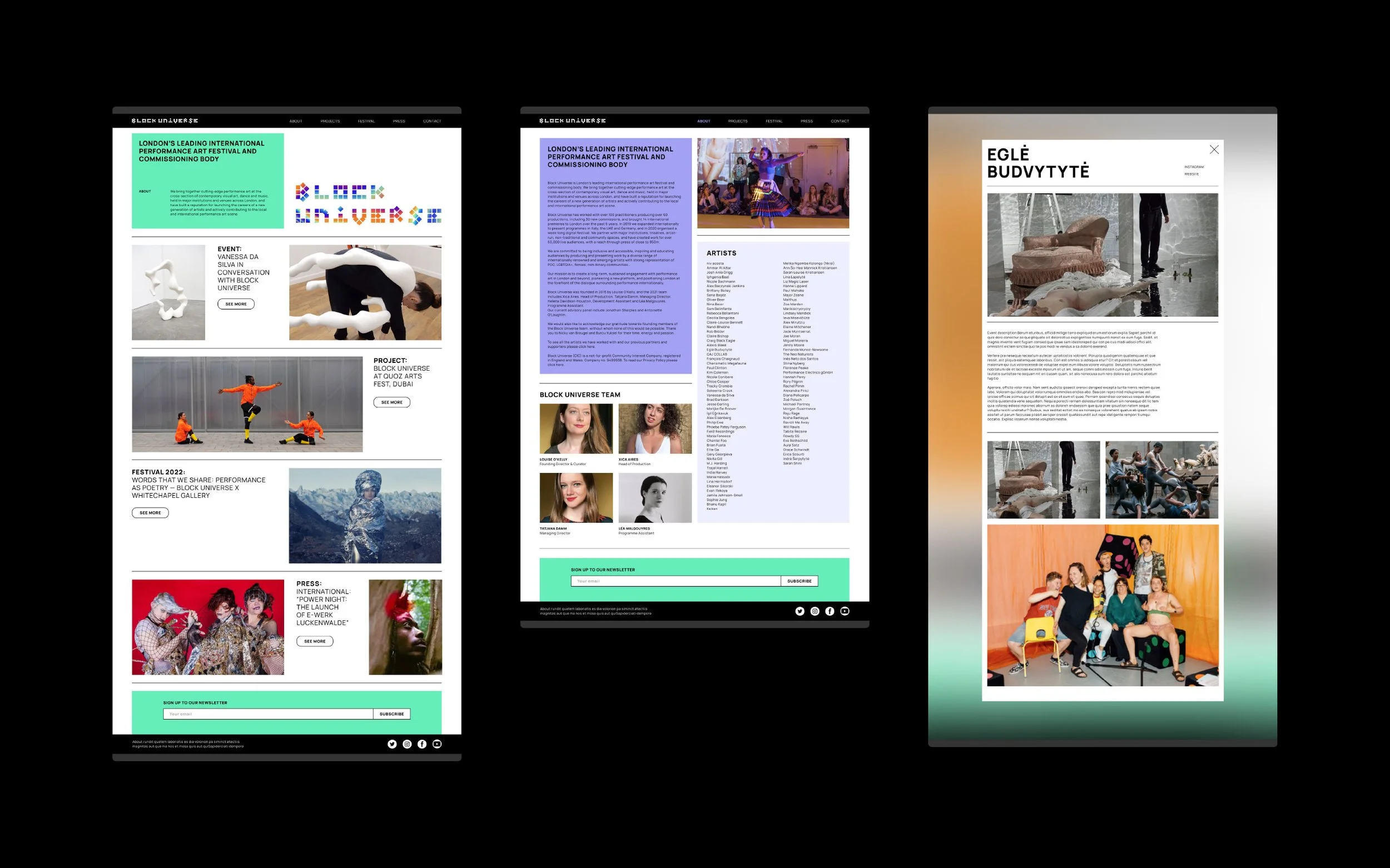
A crucial understanding emerged that it was essential for users to view artists prominently at the top level, rather than having to delve into specific festival events to find this information. This realisation led to the decision to create a distinct section for artists, separate from the festivals, on the about page.
Ideation and Prototyping
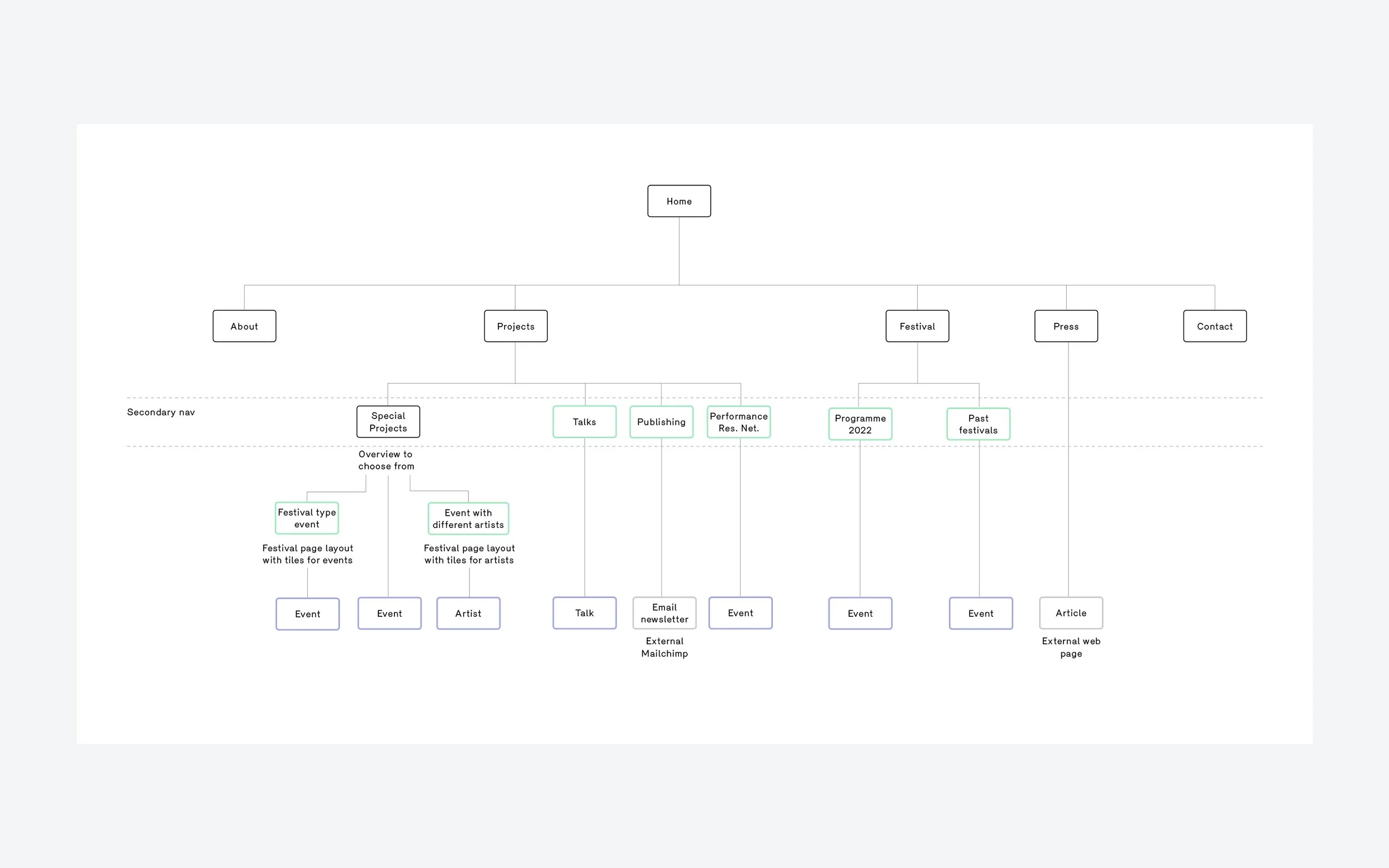
Sitemap
Developing the sitemap allowed me to establish a clear structure for the platform. I aligned this structure with the user journeys I had previously outlined, ensuring a smooth and intuitive experience for users.
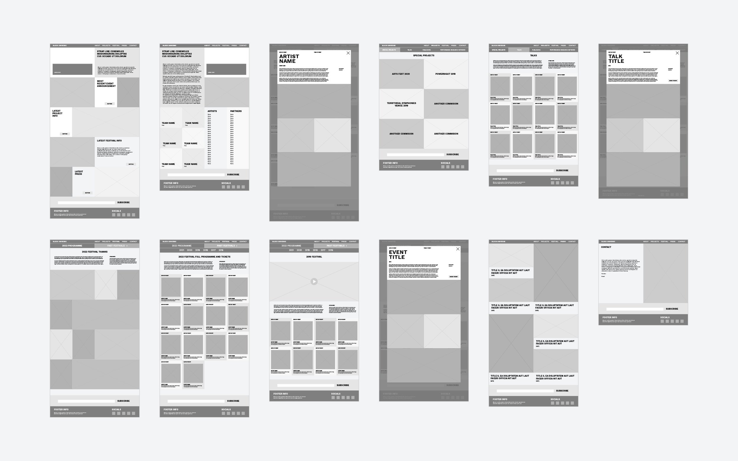
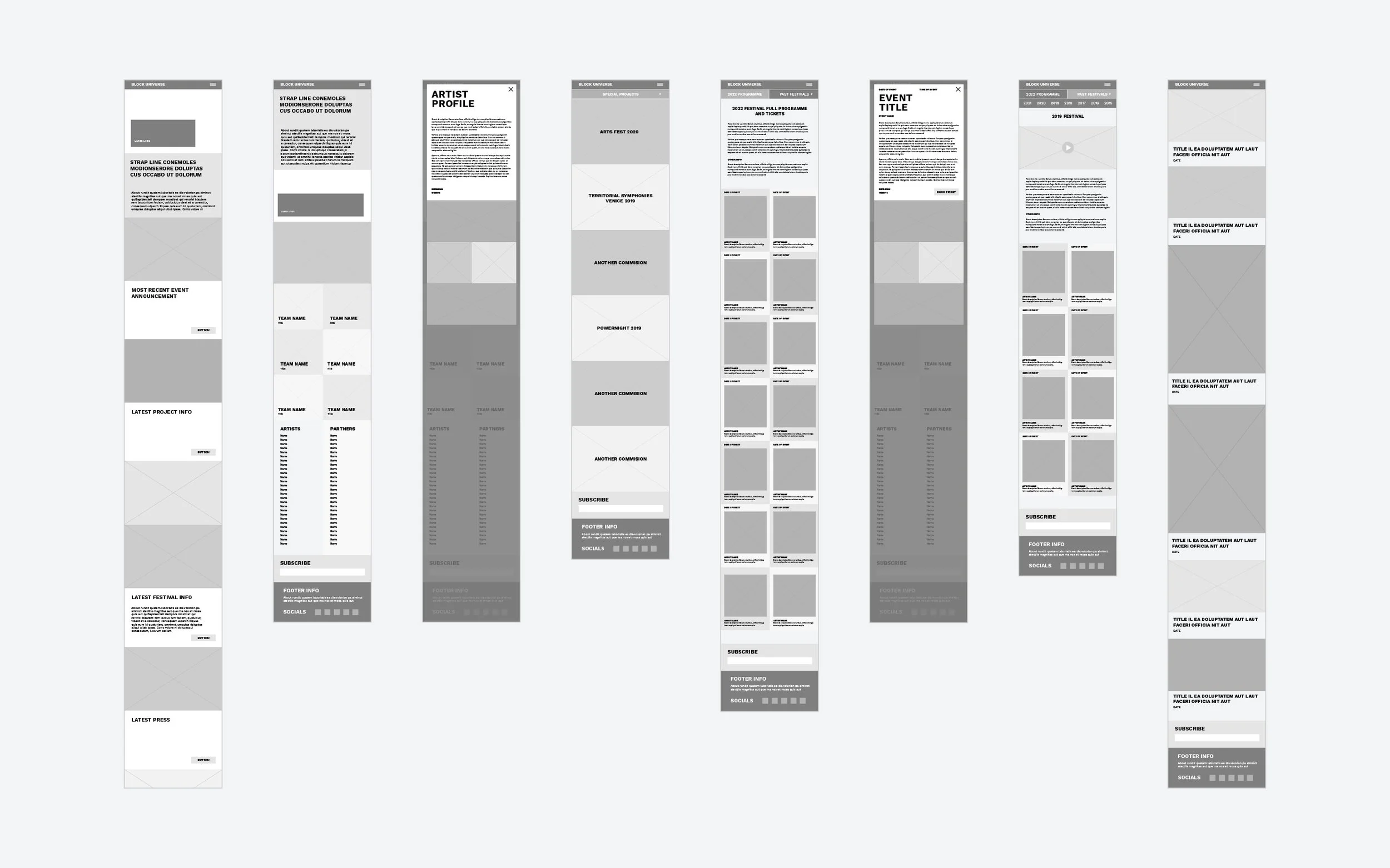
Wireframes
Since the website wasn't overly complex, with many pages sharing the same layout, it was logical to create wireframes for the entire site.
Low Fidelity Prototypes
I conducted remote usability testing via video call, assigning clear, well-defined tasks to users. I asked them to say what they were thinking and provide feedback throughout the process. I gained some great insights from the users, a couple of notes were:
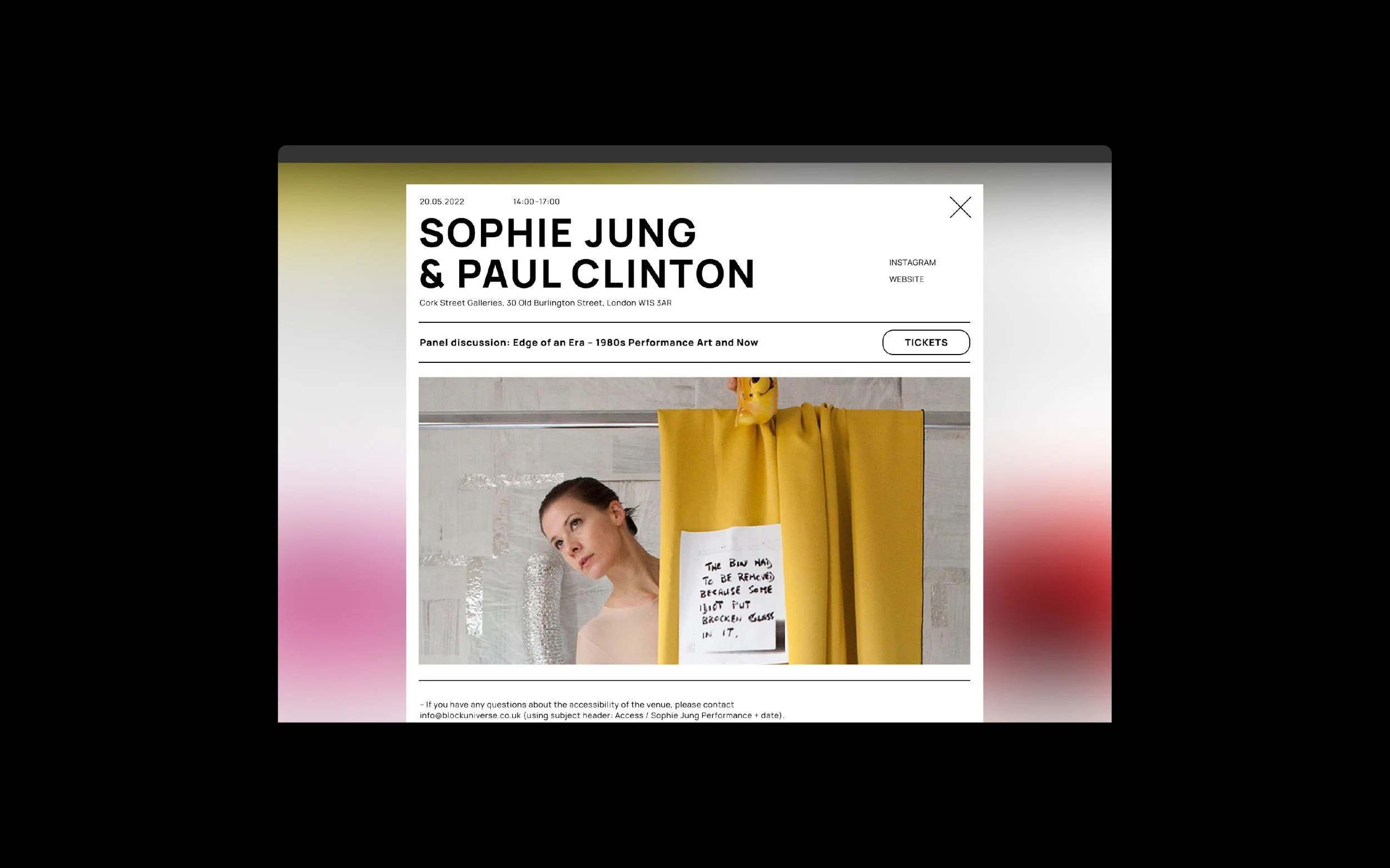
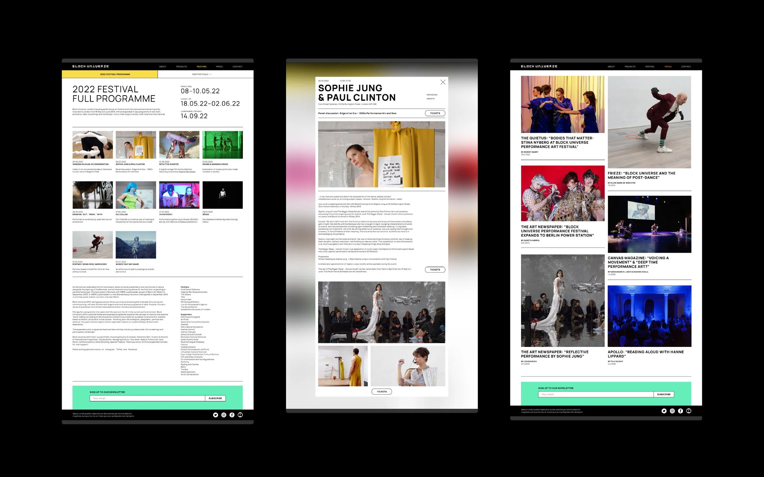
That scrolling back to the top of an event page to book a ticket was frustrating. So we added in 2 more buttons along the event description.
That the date on the festival event tiles was too prominent and disjointed from the title. So we moved it to sit with the title below the image.
High Fidelity Prototypes
We asked the users for their visual feedback of the layout and placement of assets. A key point raised was that they thought the body text was a bit too small, which led me to increase it across the site.
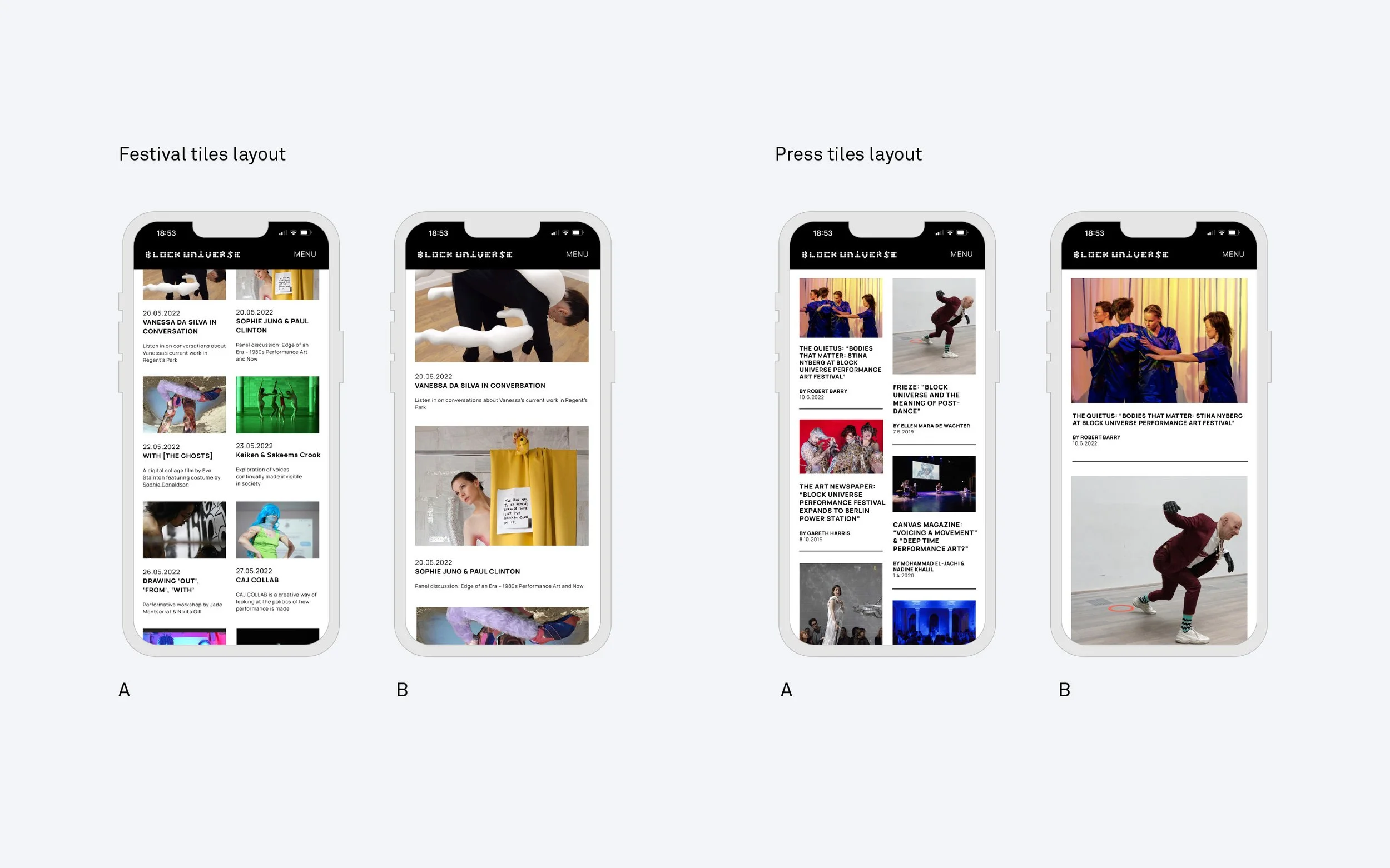
A/B Testing
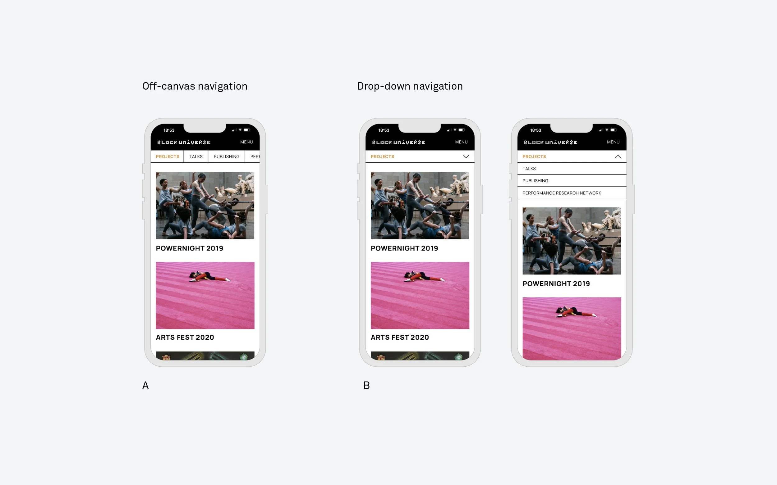
I conducted A/B testing on mobile for the two-column grid layout for both the Festival and the Press pages. I wanted to determine if this layout provided a faster, more comprehensive overview, but I wanted to gauge user reactions. The feedback showed that users preferred it for the Festival pages but not for the Press.
“The two-column layout works well for the Festival page because I can see lots of events at a glance. But, a single column feels better for the Press page as there’s less content to browse through.”
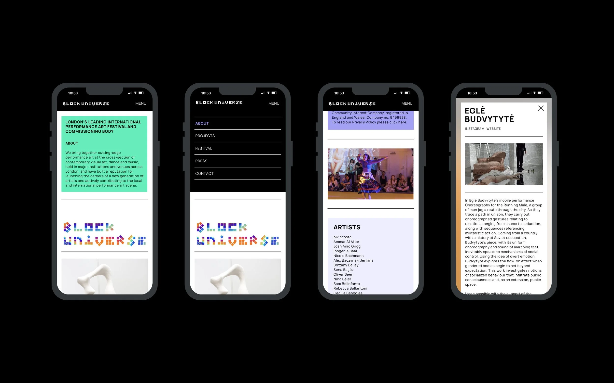
Final designs
Results
Enhanced the user experience significantly, leading to a 38% improvement in user satisfaction with the website's ease of use.
The new design resulted in a 12% rise in average session duration and was recognised positively in the performance art scene.
Achieved a 22% growth in website visits from the target demographic, reflecting successful audience expansion.
One of the primary features we planned to introduce of booking ticket events through the site was set aside due to it requiring more time and effort than anticipated. Consequently, we continued with allowing event bookings through Eventbrite, a decision that users were happy with, given their familiarity and trust in the platform.
